Measuring What Matters
How do you prove the value of a design system? It’s a question every systems team grapples with. The scary part? We realized we didn’t have a good answer. When leadership asks ‘What’s our ROI?’ and your best answer is ‘People are using it’… that’s not going to cut it. So I rolled up my sleeves, and got to work. Over a period of six months I developed a framework that took my teams metrics practice from a simple survey to a strategic tool that influences our roadmap and helps secure investment.
Design Systems ROI
Our team was about a year and half into building our design system, Atmosphere, and questions about the ROI were swirling through the minds of our senior leadership team. The only piece of tangible evidence we had was a brief survey that we had sent out once. It consisted of three questions: ‘What’s your primary role?’, ‘How satisfied are you with your Atmosphere experience?’, and ‘Is there anything you would change?’. That survey received nine responses. As you can imagine, it’s hard to defend the investment into the system with that — let alone advocate for more investment.
One metric to rule them all
At first, I looked to see how others in the design system space had tackled this issue. My browser tabs were overflowing with articles and case studies that espoused the importance of quantitative metrics that gave you hard numbers around adoption. As with any product, just because you build it, doesn’t mean they will come. You need to evangelize it, build up a community, and make using the system the path of least resistance – and the only way you can be certain of your progress, is to measure it. So I set out to measure our systems adoption.
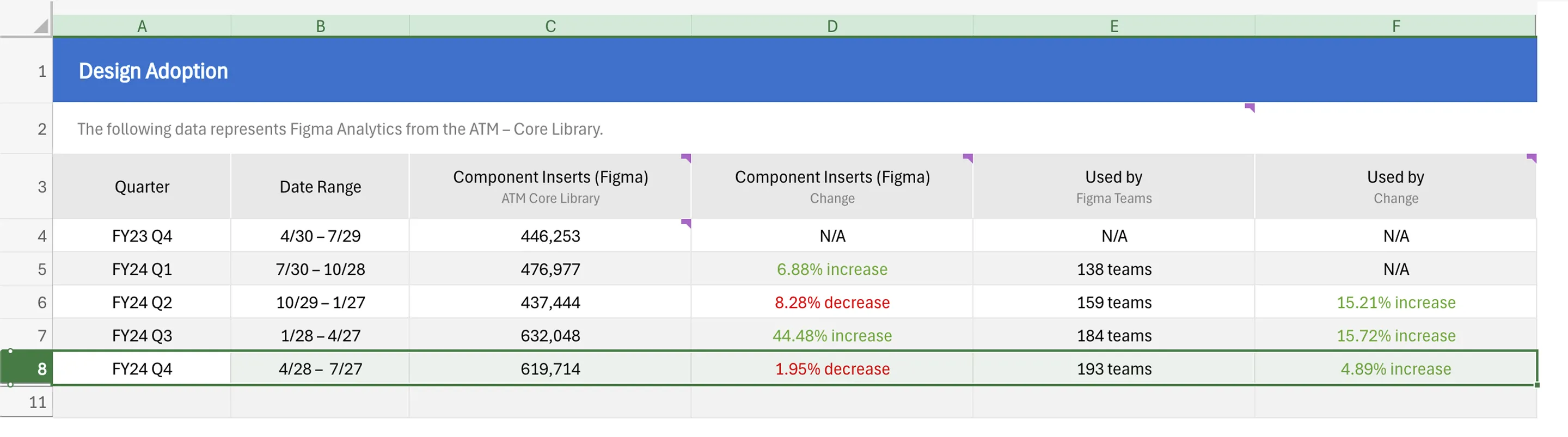
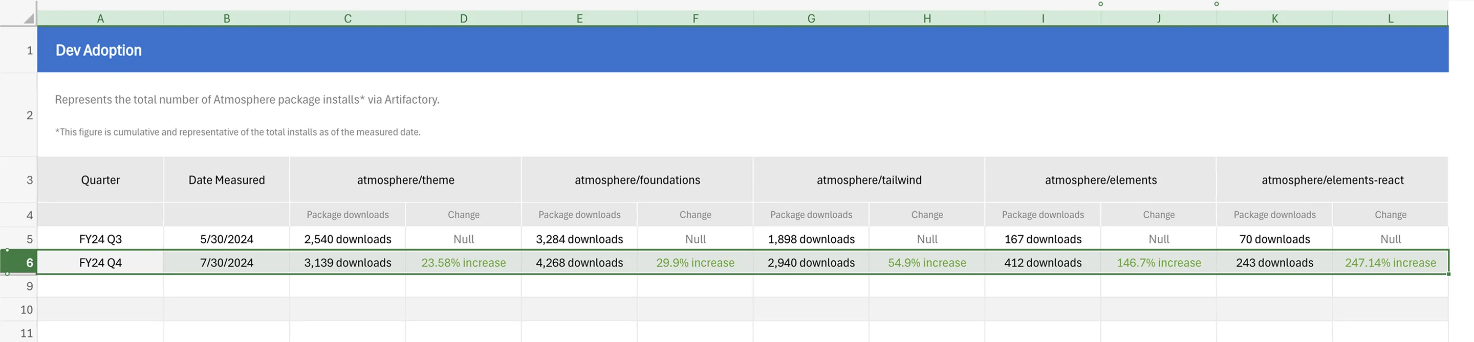
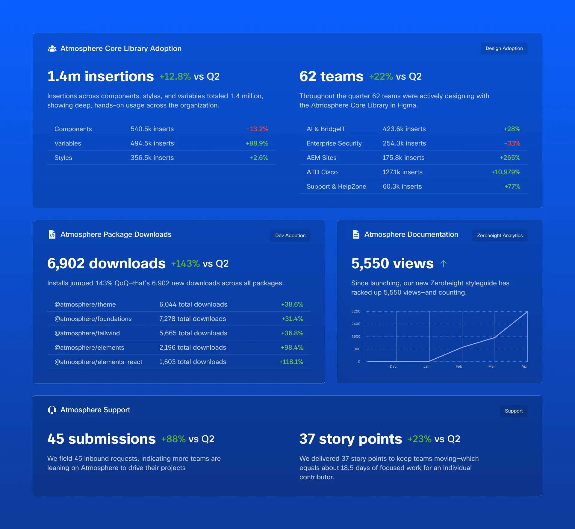
First I needed to get a sense of what data was available. On the design side we had Figma Analytics. This measured things like component insertions and detachments, the number of teams using the library, and so forth. On the development front, all we had was the cumulative number of package downloads. More advanced tracking such as telemetry or CLI-based usage logging, would require buy-in from devs across the enterprise and a lengthy security review.
The Realization
Ultimately, what I discovered disappointed me. We could really only answer one question, ‘Is the system being used?’. The answer – yes, it was. Beyond that, I couldn’t say much. Sure, we now knew what components were being used, which meant we knew where to invest in usability. We also learned which packages were being downloaded the most — giving us an indication of whether teams were adopting both our tokens and our components. These were helpful insights but I needed more to tell a compelling story. What was the fidelity of the adoption? Which teams were using Atmosphere? Which were not? How did our users feel about the system? What were our strengths? Our weaknesses? How much effort were we putting towards supporting our consumers
The Shift
In that moment I realized something important.
I was optimizing for measurement instead of understanding.
Quantitative metrics alone would not be able to answer all of my questions and while they were helpful, collecting them was time consuming. If we wanted to continue gathering that data, we needed to find a way to automate it.
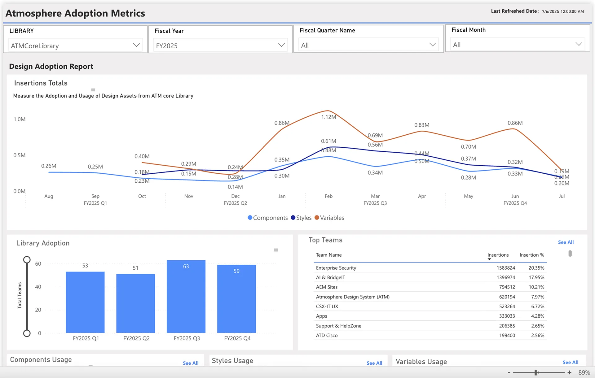
To address the tedium that came with gathering that data I collaborated closely with a developer to build an automated metrics dashboard that removed the burden of manual data collection and freed up team resources to focus on more impactful work.
The Key
Looking back at our survey I knew there was potential to turn this into a valuable resource. I reached out to our UX research team, and we put together a plan to build a robust survey that captured much more than just a role and satisfaction score.
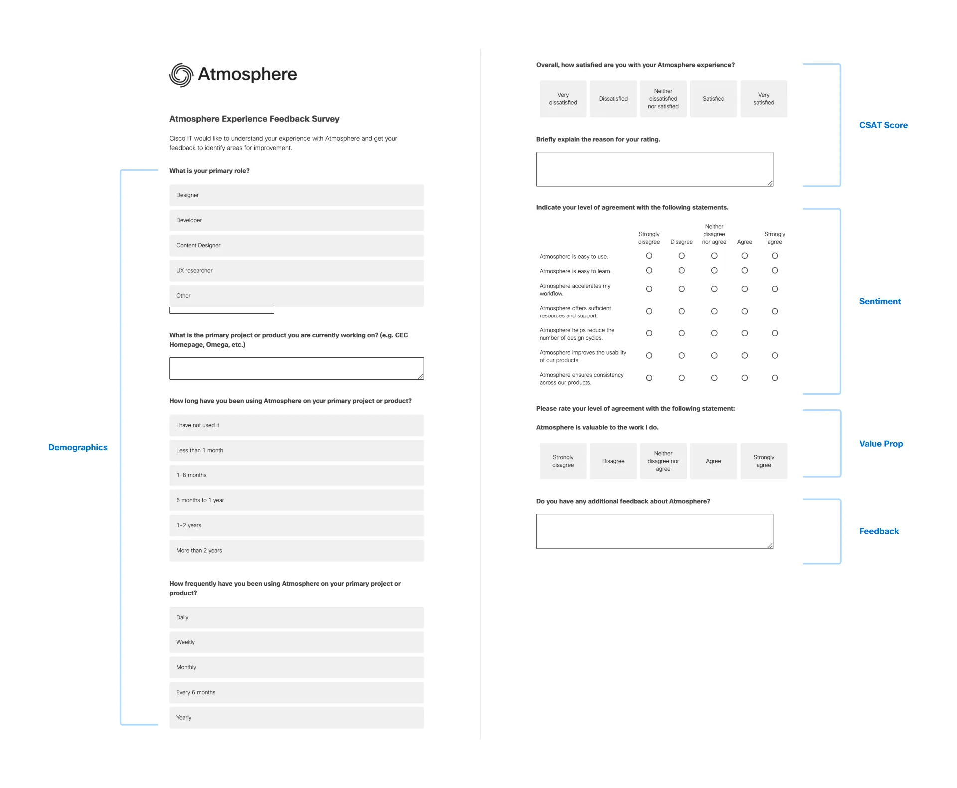
Our newly minted survey got to the heart of our consumer sentiment, and assessed whether or not the system was living up to it’s core promises. The results validated our approach – survey participation increased 147% from 36 to 90 responses, proving that people engage when they see their feedback creating real change.
| FY24 Q2 | FY24 Q4 | FY25 Q2 |
|---|---|---|
| 9 responses | 36 responses | 90 responses |
The Insight
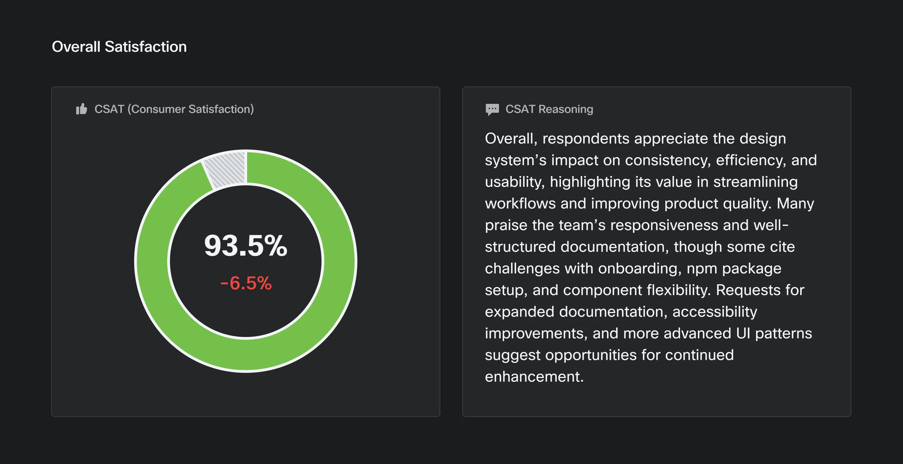
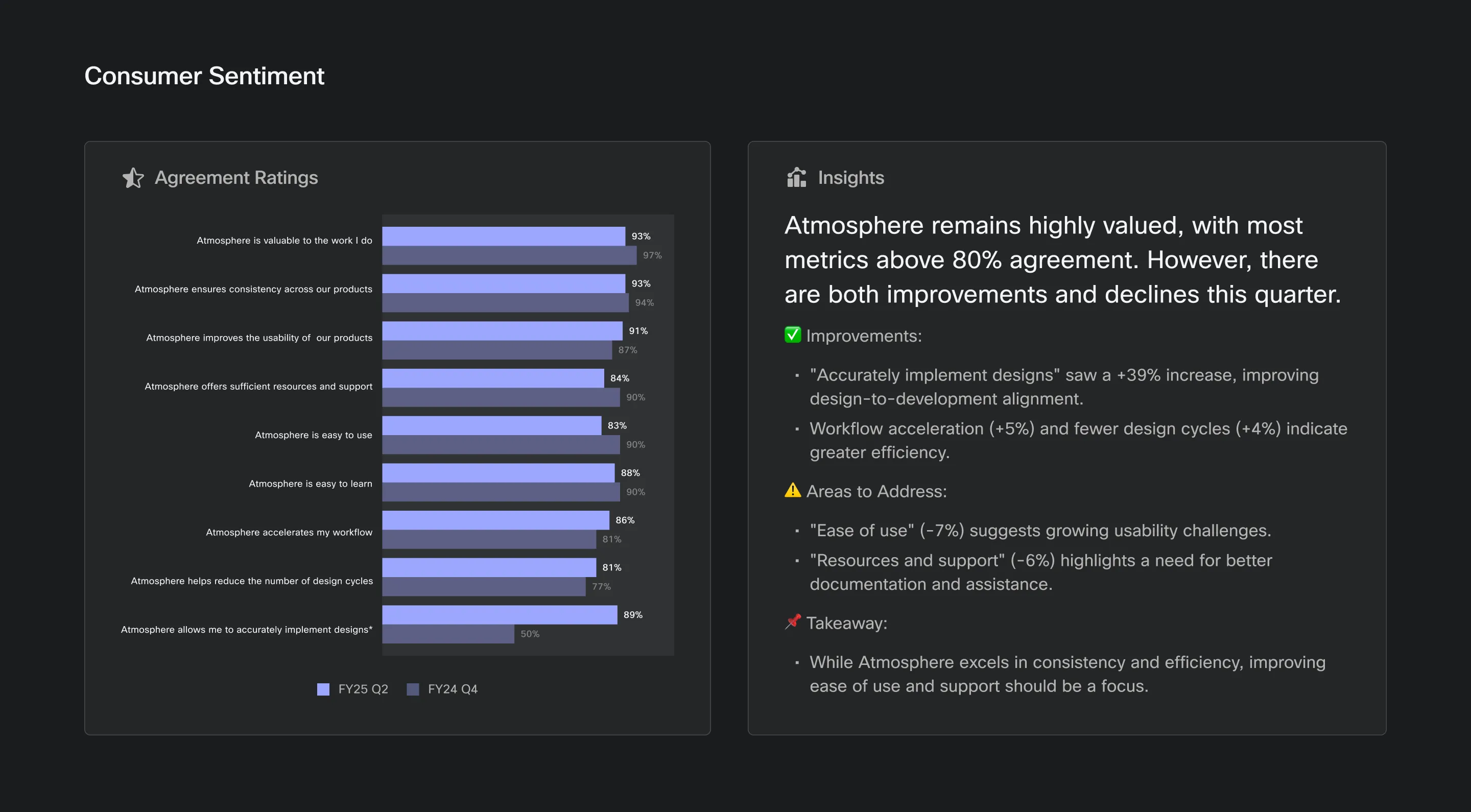
Armed with feedback from real users, I could start to answer my questions. Not only had it illuminated blind spots, but it made it clear where our focus should be to build a better system. Users were reporting higher than anticipated friction, specifically around the systems ease of use, resources, and support.
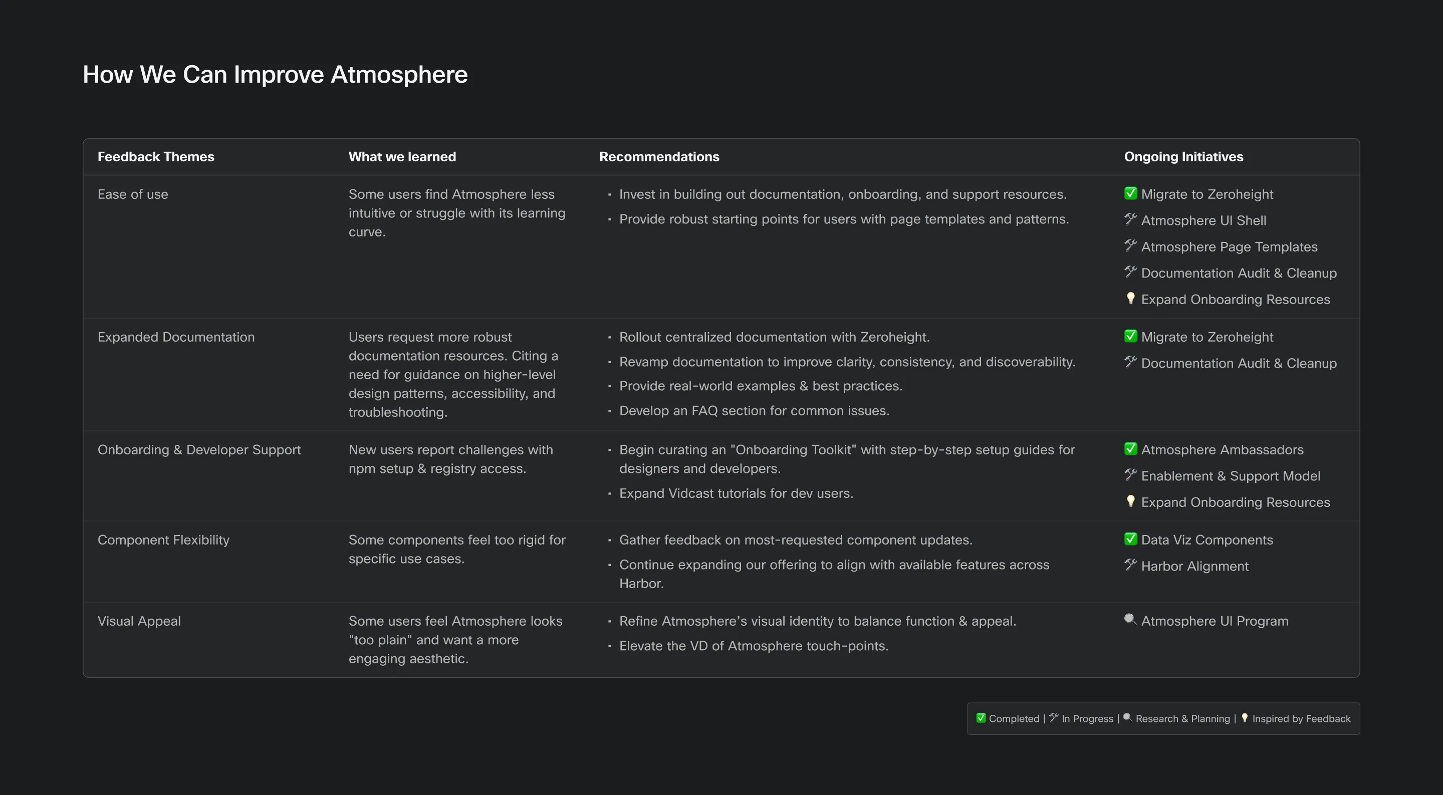
Upon further investigation, it was true. Our responses to support inquiries weren’t timely, our documentation was scattered and out of date, and our onboarding resources were thin at best. Solve for those and there’s a very good chance you’ll see improved adoption. So that’s what we did, we implemented a first responder protocol to ensure questions were answered quickly, we overhauled our documentation, and expanded our onboarding and training materials.
The Ripple
This new, more comprehensive framework of metrics, was changing how we approached our work. We were no longer flying blind, we had answers and we could plan rather than react. It became a crucial data point for informing our roadmap, and helped us advocate for investment in key areas of the design system, such as documentation. As our team scaled our documentation was getting left behind and users quickly let us know they felt it. To address this issue, we initiated a overhaul of our documentation resources. We actually referenced our metrics to help justify the need for a license for Zeroheight. That work centralized our resources into a single source of truth and solved for many of the issues raised by our users.